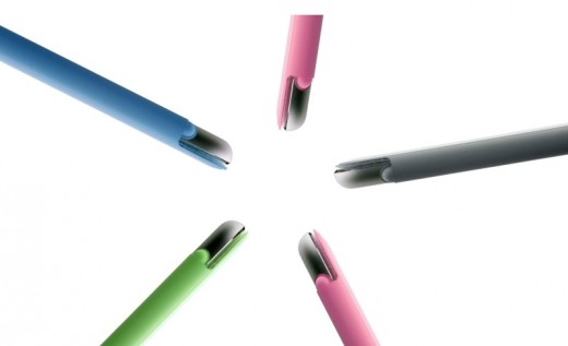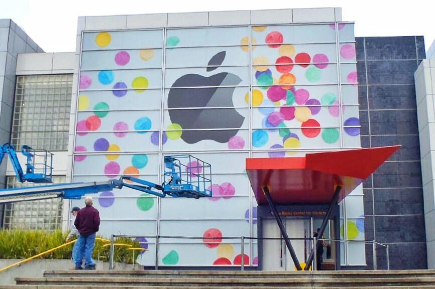
With Apple's September 10 keynote now officially a go, die-hard fans and watchers alike are falling over each other as they scramble to unearth the subtlest of hints from the invite graphics in their never-ending quest of deciphering the meaning of life. For the most people, yours truly included, it's just naturally assuming those colorful dots set against the white background tip off colorized iPhones.
But isn't that kinda too obvious? Thanks to the folks who think differently and put much more thought into it than your average person, I can figure out such stuff that would have otherwise never crossed my mind. Take, for example, Twitter user i0livier who in a series of tweets reminded us that Apple used a similar design theme two years ago.
Bear with me for just a second...